
UI/UX Design · 2025
Axero
A UI/UX design for a B2B workspace platform’s integrations page, built to make a 30-plus integration library feel like a reason to buy rather than a spec sheet.
- Figma
- UI Design
- UX Design
- Design System
- Year
- 2025
- Type
- UI/UX Design
- Location
- Concept
The challenge
Integrations pages are usually the least designed page in a B2B product. They default to an alphabetised grid of logos, which reads as an inventory and asks the visitor to do all the work of imagining what any of it means for them.
For a workspace platform this is a costly place to be lazy. Integrations are frequently the deciding factor in whether a team can adopt the product at all, so the page is closer to the purchase decision than most marketing pages.
What I built
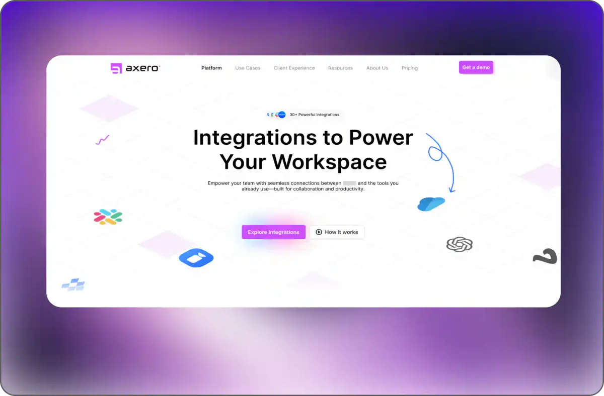
The design leads with the benefit rather than the inventory. "Integrations to Power Your Workspace" frames the library as capability, and the supporting line is explicit that this is about connecting to the tools a team already uses — which is the actual anxiety being resolved, since nobody wants to abandon their existing stack.
The 30-plus count sits in a compact badge above the headline rather than as a wall of logos. It supplies the scale signal immediately without forcing the visitor to scan a grid to work out whether the platform is serious.
Recognisable tool marks are then scattered through the hero as floating elements against a light, airy field. A visitor scanning for their own stack finds it in peripheral vision without the page turning into a directory, and the composition stays calm instead of dense. Two calls to action split by readiness: explore the integrations, or watch how it works.
Outcome
The page argues that the integration library removes an adoption barrier, rather than listing logos and leaving the visitor to draw the conclusion themselves.