
UI/UX Design · 2025
Kachava
A UI/UX design for a superfood meal-replacement brand, balancing appetite appeal against the nutritional proof this category has to supply.
- Figma
- UI Design
- UX Design
- E-commerce
- Year
- 2025
- Type
- UI/UX Design
- Location
- Concept
The challenge
Meal replacement sits in an awkward gap. It is bought like food, so it needs appetite appeal and warmth — but it is justified like a supplement, so it also has to survive scrutiny of what is actually in it.
Lead too hard on lifestyle imagery and the health-literate buyer dismisses it as marketing. Lead on the ingredient panel and it reads clinical and joyless, which is fatal for something a person has to want to consume every day.
What I built
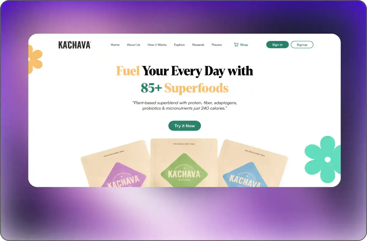
The headline carries both halves at once: fuelling your every day supplies the emotional reason, and 85-plus superfoods supplies the substantiation, with the numeral doing the heavy lifting because a specific number reads as verifiable in a way that "packed with nutrients" never does.
Directly beneath, the subhead front-loads the technical proof — a plant-based superblend with protein, fibre, adaptogens, probiotics and micronutrients at just 240 calories. Putting the full composition above the fold means the sceptical buyer is answered before they scroll, and the calorie figure preempts the obvious objection about a meal replacement being heavy.
Visually the design stays warm rather than clinical: soft organic floral shapes in muted green and amber frame a light field, and the product packs are shown fanned and large so flavour variety is legible at a glance. Navigation exposes how it works, flavours and rewards, and the primary action is a low-commitment invitation to try it rather than a demand to buy.
Outcome
The design lets the brand read as food rather than supplement while still putting the nutritional argument above the fold, where the sceptical buyer meets it first.